BEDE

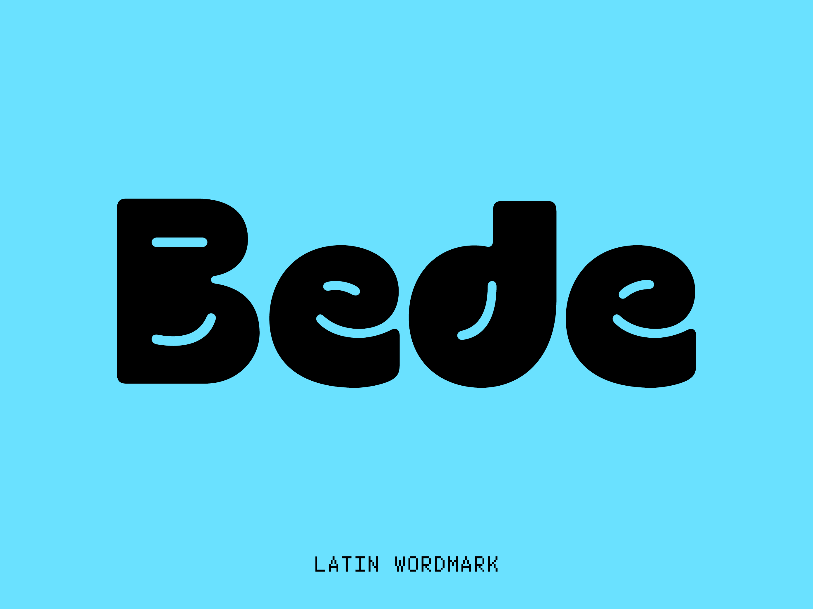
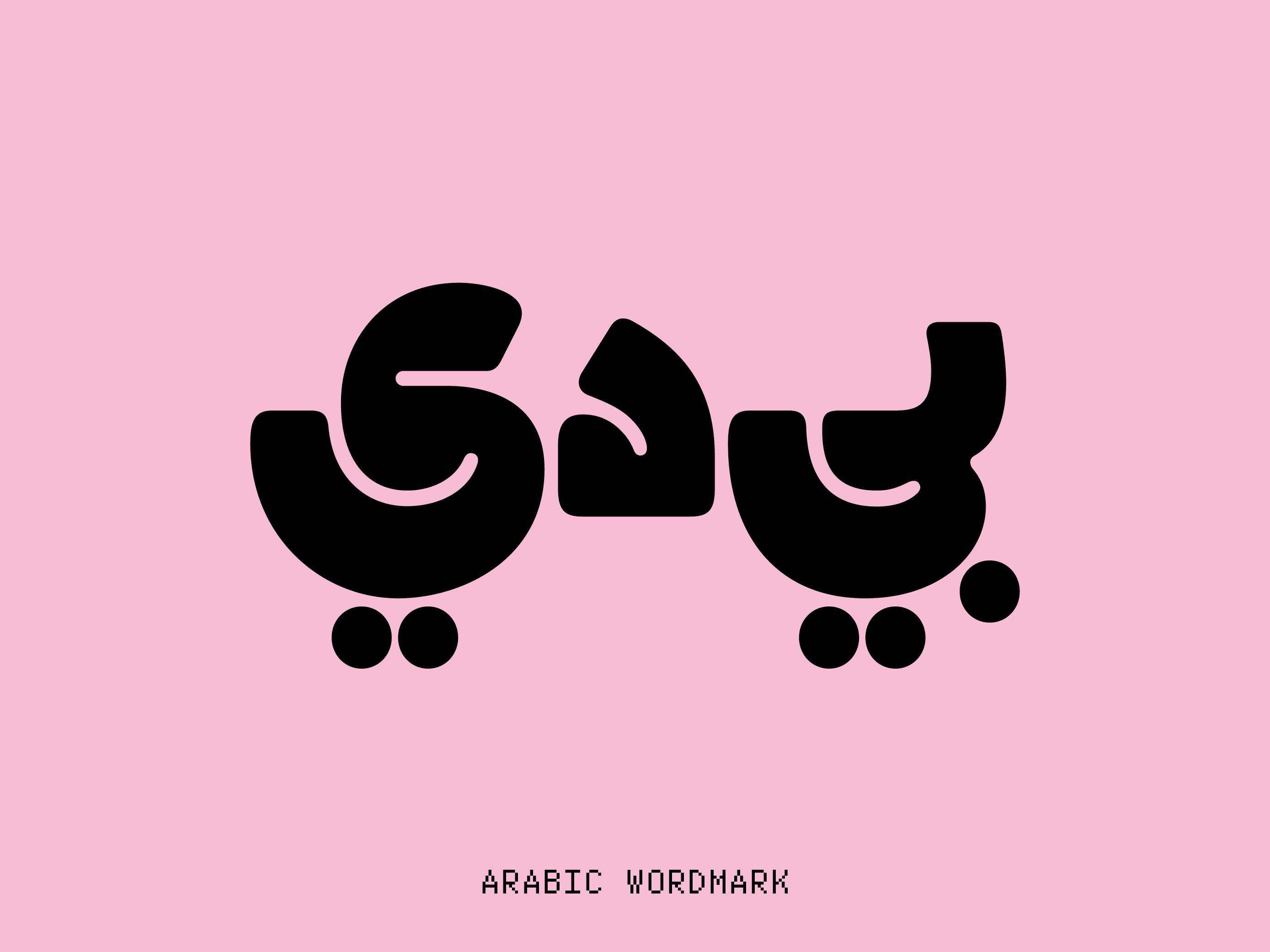
Custom wordmark for Bede, an innovative personal finance solutions provider based in Bahrain. Drawing inspiration from the brand name, which means "in my hand" in Arabic, I designed the wordmark in both Arabic and English, ensuring a cohesive visual identity across both scripts. The design captures the same look and feel in each script, reflecting Bede's mission to empower clients with financial control. As a result, the bold and friendly wordmark effectively conveys Bede's core values of innovation, trust, and empowerment, through dynamic visual elements and a lively color palette, reinforcing the idea that personal finance can be accessible and manageable for all audiences.

Wordmark Design by Ignacio Casco Guijarro.

Art Direction by Hondo Studio.
Motion Graphics: Usuario Studio.
Strategy: Beattie and Dane. 

Furtive Mono Slab

Is a monospaced slab serif based on Furtive Mono. It was completly redrawn to incorporate the slab serifs but keeping the grotesk influences from the original design. This new style…

Supports extended Latin languages, with 710 glyphs, one weight, two styles and alternate characters.

Furtive Mono

Is a monospaced typeface designed to make the code cleaner and cool. It has a grotesk DNA with some specific adjustments to make it better at small sizes, but those technical adjustments look fantastic at big sizes providing a strong personality and power.

Perfect for coding or to show code samples in a presentation, but with its huge set of OpenType features it also works good for other design pourposes.